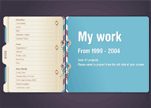
Erik Otten
Designer Erik Otten created this uncomplicated Flash site to display his portfolio. Visitors will enjoy browsing Otten's project files, as the site's navigation is as straightforward as the site's organization is logical.
Loading...

Designer Erik Otten created this uncomplicated Flash site to display his portfolio. Visitors will enjoy browsing Otten's project files, as the site's navigation is as straightforward as the site's organization is logical.

Usability experts: Beware of this website's navigation. Here all directional commands are executed by a cheerful little bluebird that is sometimes unable to fly. Undoubtedly, fans of Flash games will enjoy this website.
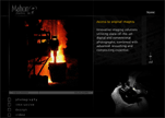
Offering a stunning selection of full service design, interactive media, video production and commercial photography, advertising and design agency Mahon Studios has it all. There is little doubt that this Clean Style website will be appreciated by devotees of Flash.

What does a person think about when shopping for clothes? Clothing, of course. Here you’ll find nothing if not clothing. Luis Ofore’s designer collections are shown to great advantage on this Clean Style website with Flash effects.
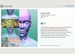
Spinning before your face, ioResearch Studio’s portfolio files present a whimsical virtual tour of every project that the firm has completed. This is not a bad example of a Clean Style website.
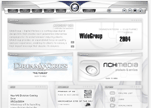
Altogether an impressive project, this Flash Style website lets visitors know that original website solutions exist. For example, the menu has the form of a snake.
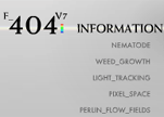
Robert Hodgin demonstrates what can be done with Flash and Processing, and makes a colorful impression on his website visitors while using a gray background.

Take part in a game of anti-acoustic warfare on this Futurist Style website. Here you'll see how critical a role navigation can play in shaping a visitor’s experience.

Learn how to put the seduction strategy to work in a website. The bewitching header in this Flash site compels visitors to browse each button on the menu bar. Hot colors set the mood, as well.

Upon entering this Clean Style site, you feel as though you have entered nature. Here you can spin your head to scan the horizon. Be careful. You could strain your neck.

Daddy Yankee's promotional site makes no pretensions. It's all about money. Despite its obvious push to purchase, the site does offer a few pleasant Flash effects.

Boasting an extensive client list that includes NBC and ATM, this graphic web design firm expresses itself simply yet effectively by using a few Flash effects and a spartan Corporate Style.

Extra! Extra! Read all about it! Website designer Kevin Cornell gives visitors an entertaining glimpse of his inner world. This personal page executed in Paper Made Style resembles a daily newspaper.

Immense background pictures and a small menu leave good impressions of this Minimalist Style site. It's all about understatement. Less is more, according to fashion designer John Varvatos.

A fine array of images leaps from the pages of this artist's portfolio. Likewise, the unusual navigation menu seems to follow you like a curious wandering vine as you trek across the page. This Dark Style Flash site is truly, eerily alive.

Mmm...a Japanese restaurant opens before your eyes. The delicious background colors and vivid photographs on this Retro Flash site certainly whet the appetite.

Playful images of well-dressed, elegant women fill the website visitor with the desire to join in on the fun being had by all in this Minimalist Flash site. There's no better way to get a shopper to buy.

Flirtcosmetics.com illustrates the importance of cosmetics one click at a time. Alluring models appear and disappear in this Clean Style Flash site, giving the visitor the impression that it´s all just a tease, an innocent game of peek-a-boo. Ultra feminine. Ultra effective.

This fashion site, successfully executed in Clean Style, gets top marks in usability. Here Flash effects are lightweight yet impressive.

This Clean Style Flash site proves that understanding your target audience is one of the keys to building a successful business. Created with website authors in mind, it offers original navigation among other things.
Copyright © . All Rights Reserved