How to Make a Retro Text Effect
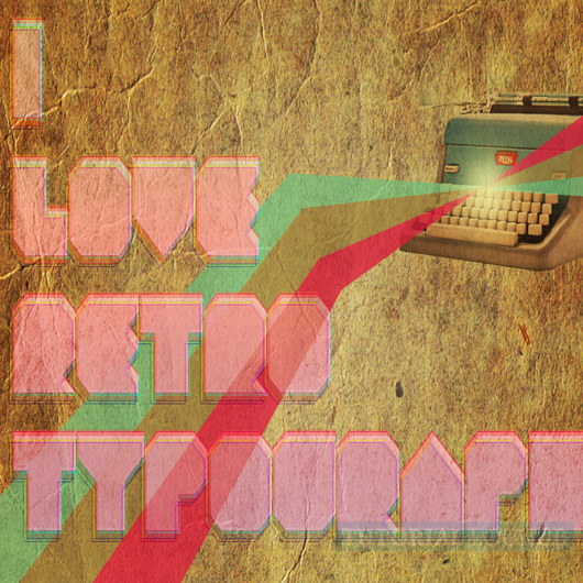
In this tutorial, we will learn how to create an Retro poster.This tutorial will cover some advance techniques of lightning ,blending modes and line art, i must say all you designer will learn some tricky ways about retro text effect using Adobe Photoshop.
Step 1
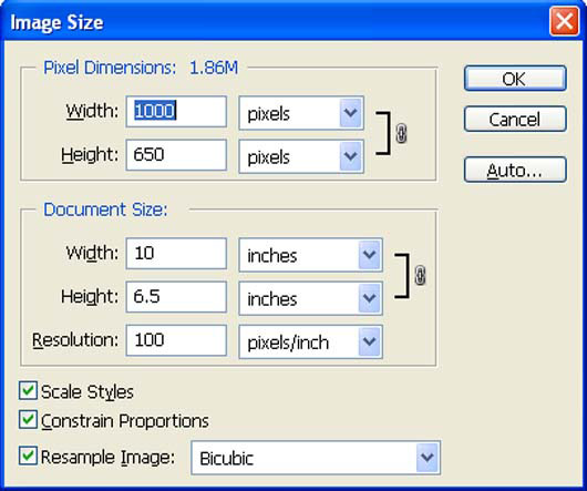
Create a new file with a width of 1000 px and a height of 650 px at 100 dpi (Dots per Inch). Background Contents should be White.
Step 2
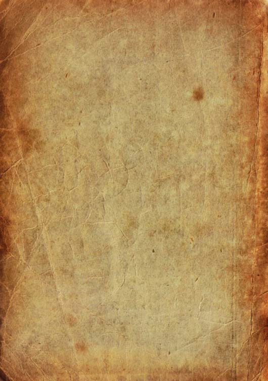
First off, let's open the paper in Photoshop. We will be using paper texture from this stock image so we will need to transfer it to our main canvas.
Click the paper and press V to activate the Move Tool. Left-click the image and drag the image to the main canvas and change layer name to "Texture".
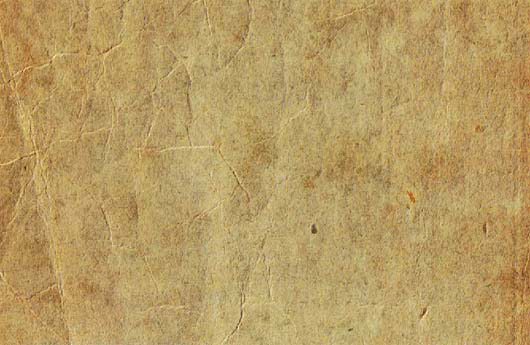
Next, activate the Transform tool (Ctrl /Cmd +T), then while the "Texture" layer is selected and then re-size it as shown below:
The result should be similar to this:
Now create new Curves adjustment layer from the bottom of layers palette.
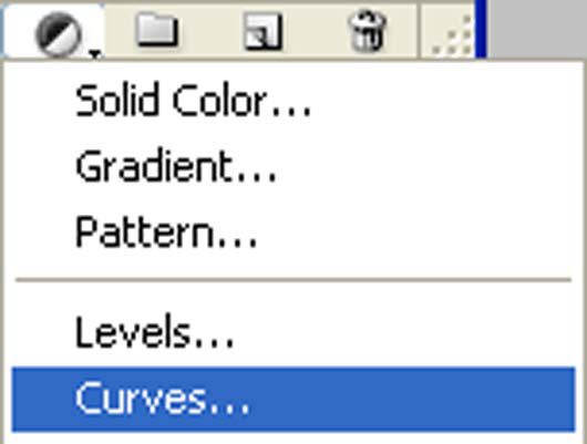
When the curves box opens, input the following:

The result should be similar to this:

Step 3
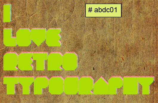
Now Instal Geist Knt font and Write "I LOVE RETRO TYPOGRAPHY" .
Use Color #abdc01 as foreground color.
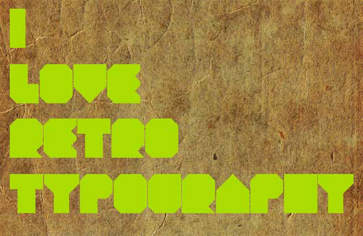
Now we're going to make a duplicate of this layer just to be safe, and because we will be duplicating the base quite a bit. Press CTRL + J to make a duplicate. Hide the original base.
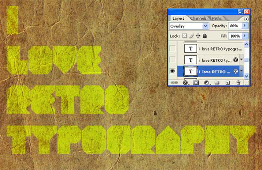
Now change the layer mode to "Overlay" and opacity to "80 %" .
Double click the layer to get the Layer style window. Select the gradient tab and pick out a nice gradient. I've used the These colors (#101010) to (#ff3d5d).
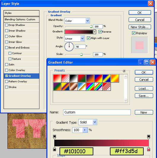
The result should be similar to this:

Duplicate the base text layer and drag it to the top. Then again Double click the layer to get the Layer style window. Select the gradient tab and pick out a nice gradient. I've used the These colors (#f4036a) to (#fd9927).
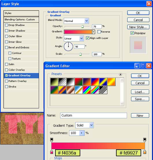
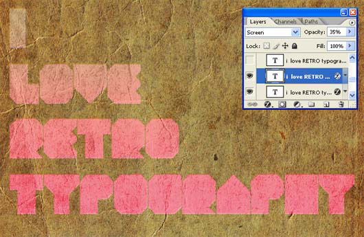
Change the layer mode to "Screen" and opacity to 35% .
Select your text and move it slightly to the right, offsetting it.
The result should be similar to this:
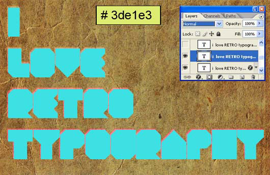
Duplicate the base once again, drag it to the top and instead of changing the gradient on it, change the text color to a bright blue (#3de1e3). Offset the text to the right once again.
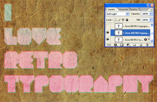
Change it's layer mode to "soft light":
Duplicate the base layer again, drag it to the top, and while keeping the neon green color we first worked with, offset the text to the bottom left.
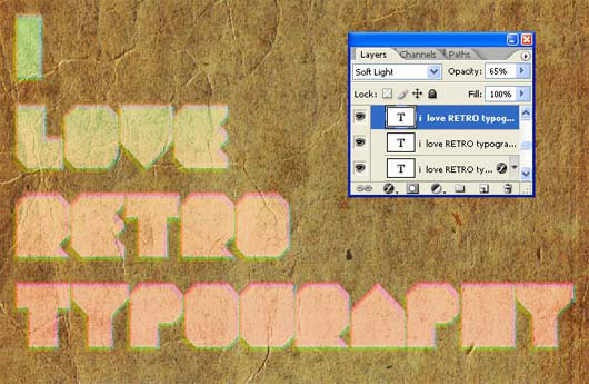
Now Change it's layer mode to "Soft light" and opacity to 65% .
The result should be similar to this:
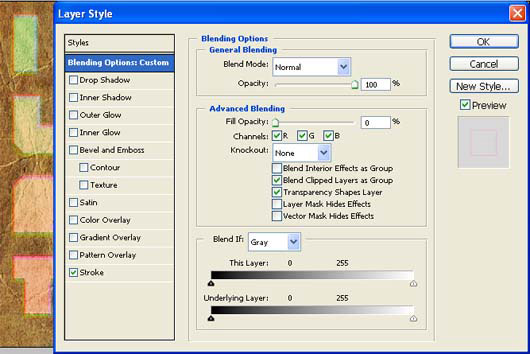
Now we're going to start adding the outline of the text. Duplicate the base text layer and drag it to the top. Double click the layer to get the Layer style window.Than goto Blending options and make fill to 0.
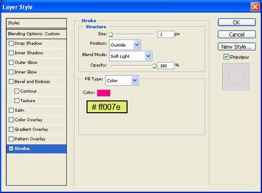
Then go to Stroke. Set this color to anything bright and fun, I'm using (#ff007e). Set the stroke to 1px and the layer style to Soft Light. Press okay.
Select your text and move it slightly to the right, offsetting it.
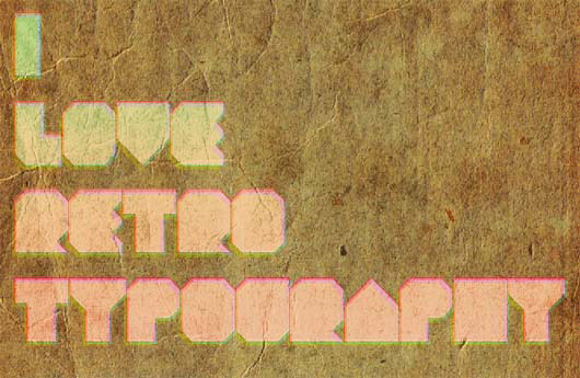
Now we're going to start adding the outline of the text. Duplicate the base text layer and drag it to the top. Double click the layer to get the Layer style window. Than goto Blending options and make fill to 0.
Then go to Stroke. Set this color to anything bright and fun, I'm using (#190096). Set the stroke to 1px and the layer style to Soft Light. Press okay.
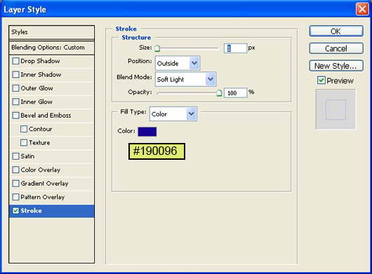
Select your text and move it slightly to the left, offsetting it.

Now we're going to start adding the outline of the text. Duplicate the base text layer and drag it to the top. Double click the layer to get the Layer style window.Than goto Blending options and make fill to 0.
Then go to Stroke. Set this color to anything bright and fun, I'm using (#146800). Set the stroke to 1px and the layer style to Soft Light. Press okay.
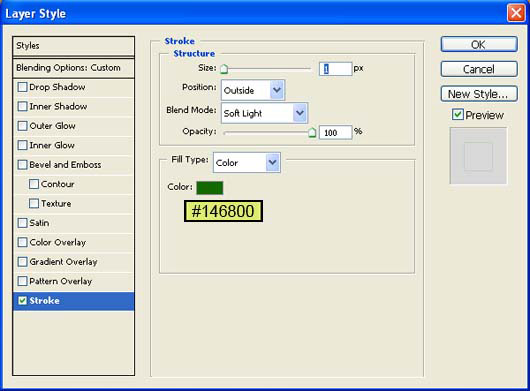
Select your text and move it slightly to the left, offsetting it.

Duplicate the base one last time and drag it to the top. Double click to get the effects and go to the Gradient tab. Change the layer blend mode to Hard Light and select a purple to blue gradient. Offset the text to the lower left.
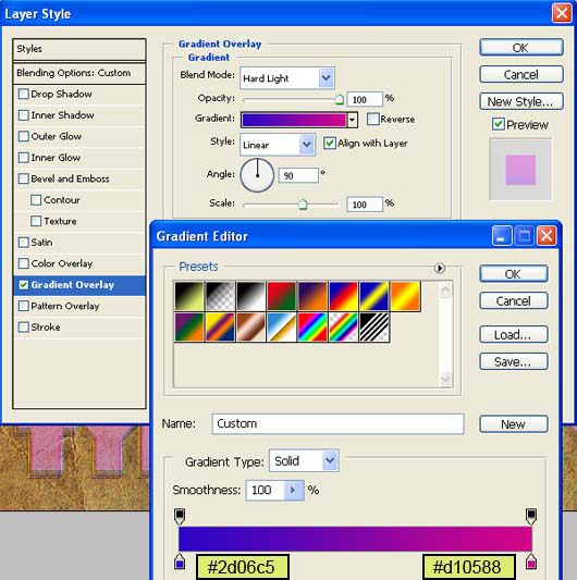
Change it's layer mode to "Screen" and opacity to 30% .
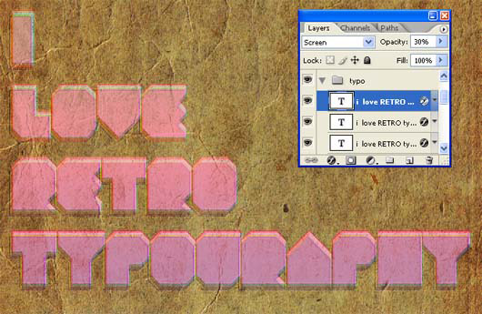
Step 4
Now let's create a source light to our image so make a new layer and name it "Source light" :
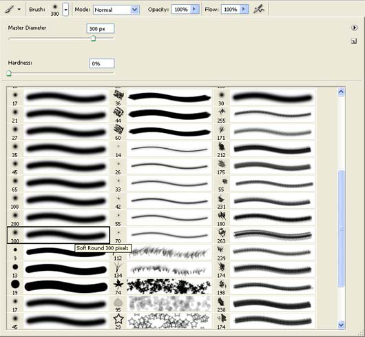
Now activate Brush tool (B) with these settings :
- Brush size: 400px
- Hardness: 0%
- Opacity: 40%
- Flow: 100%
- Color: #FFFFFF
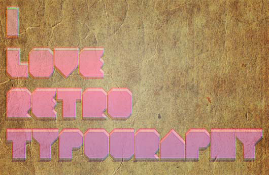
Now paint over the highlighted area.
The result should be similar to this:
Step 5
First off, let's open Royal typewriter stock in Photoshop. We will be using the typewriter from this stock image so we will need to transfer it to our main canvas.
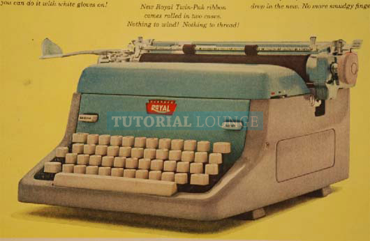
Click the Royal typewriter stock and press p to activate pen tool and then make a selection around the typewriter and then click V to activate the Move Tool. Left-click the image and drag the image to the main canvas and change layer name to "typewriter".
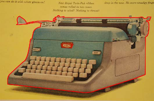
The result should be similar to this:
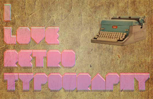
Step 6
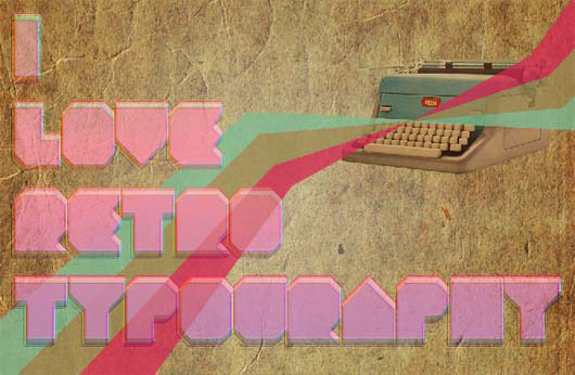
Now activate a new layer and name it "Line art" then activate pen tool and draw a pantagon.
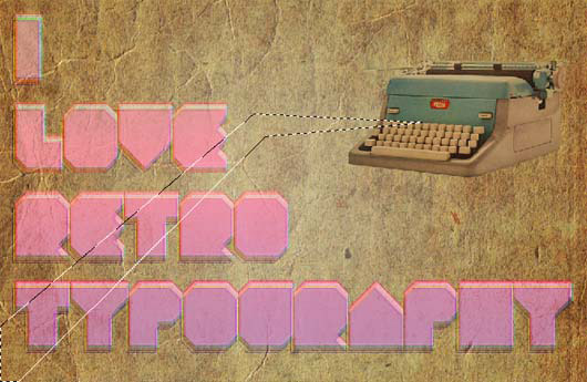
Now fill it with #7bbc92 color.
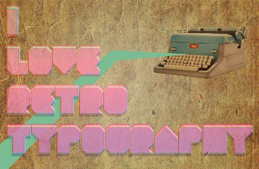
Next, Draw more line arts and fill them with following colors "#9b8a52, #d62752".
Step 7
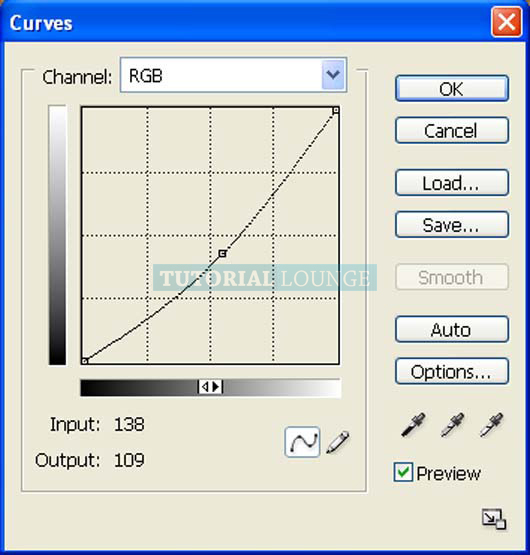
Now create new Curves adjustment layer from the bottom of layers palette .
When the Curves box opens, input the following:
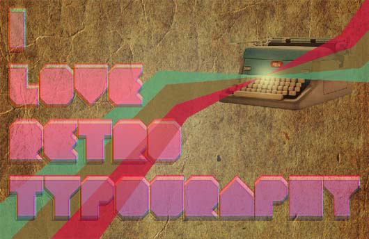
The result should be similar to this:
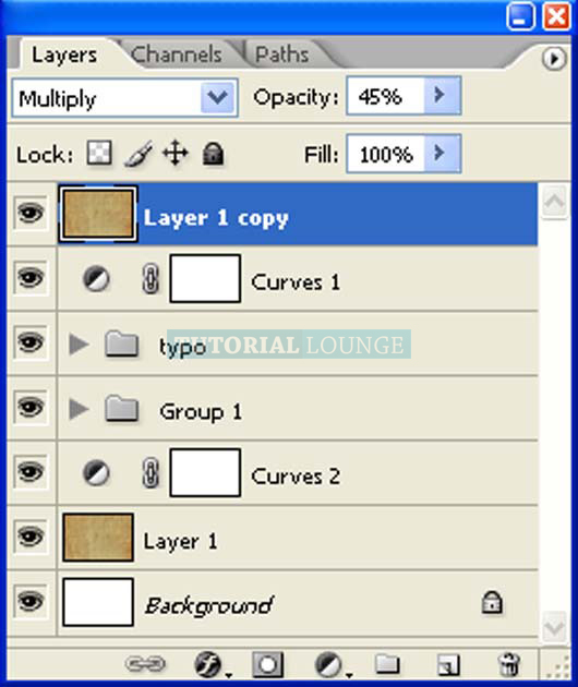
First off, let's open the paper in Photoshop. We will be using paper texture from this stock image so we will need to transfer it to our main canvas.
Click the paper and press V to activate the Move Tool. Left-click the image and drag the image to the main canvas and change layer name to "Texture".
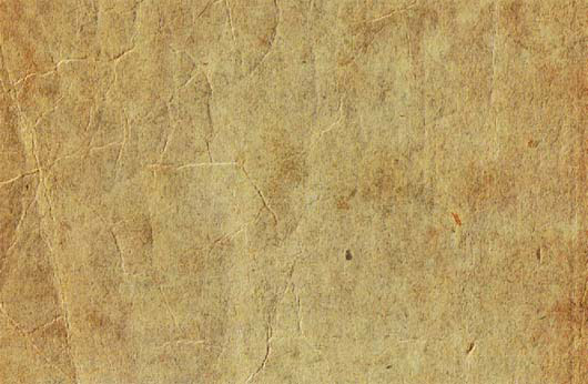
Change it's layer mode to "Multiply" and opacity to 45% .
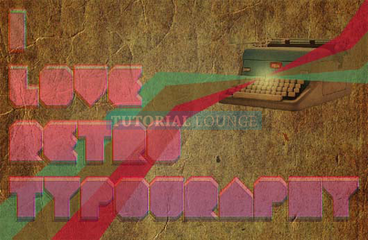
The result should be similar to this:
Copyright © . All Rights Reserved