How to Design a Contest Landing Page
From the outset, running a contest and setting up all the necessary pieces seems straightforward. You need the contest details, the landing page, a way to collect and choose winners and, of course, a desirable prize.
But the cornerstone of every contest is the landing page.
The landing page needs to be engaging, interactive and captivating. It’s where all the customers and visitors interested in participating will be funneled. It’s a massive opportunity to not only build a relationship with said customers but show them what your brand has to offer.
When designing the page, you should be concerned with much more than getting your audience to participate. You should consider the advertising and marketing opportunity and the immense potential to boost exposure for your brand, products, or services.
You also need to keep the goals of your contest in mind. The primary goal for most sweepstakes is to collect and build a database of more leads or potential customers. This requires you to collect names and contact information from participants.
Here are several ways to do that without taking away from the fun and excitement of participating in a contest.
A Simple Signup Process
The more you ask of participants, the higher the barrier of entry. You want to extract the most information possible without burdening your customers and audience. It’s a fine balance that’s difficult to adhere to.
A good rule is to only ask for information you need to run the contest. The trick then is making sure you collect details that you can also use for other marketing strategies. For example, you could simply ask for a contact email so you can reach out to the winner. You could also ask for social media account details, phone numbers, addresses and more.
Just don’t ask for everything. Trim down the form, so it’s quick, efficient and less burdensome.
Fatherly held a health and fitness related contest. Contestants only needed to provide an email address to win free clothing, a year’s supply of KIND bars, and a new Fitbit Surge tracker. That’s it! It was incredibly simple and super quick, so plenty of folks were enticed to sign up.

Focus on the Contest
Most likely, the contest landing page is a sub-page on your website or blog. That means it would be easy to bog down the page’s content and details with a lot of unnecessary fluff like a populated sidebar or footer.
Get rid of the excess clutter and focus on your call to action (CTA) and signup form. You have to assume that even if it’s the first page new customers see, they’ll branch out to the rest of your site or blog to find out what your company is about. Your landing page should be purely about your contest.
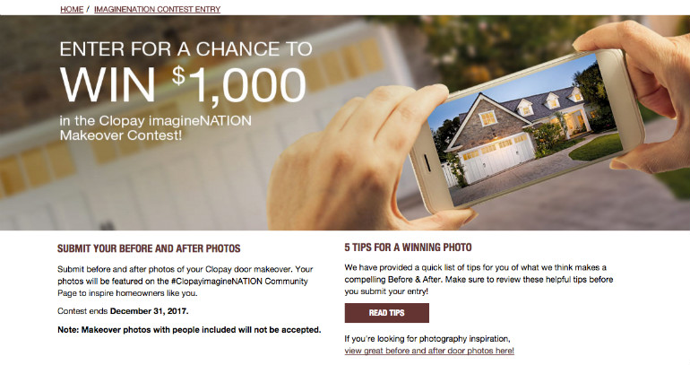
Clopay Doors is currently running a contest in which people can win $1,000 for a home makeover. Notice how their contest landing page is devoid of visual clutter? You see the event announcement, the instructions and requirements and then the entry form. And that’s all you need.

Your CTA Must Stand Out
Marketing 101 - you need a call to action that will push customers through the signup process. That CTA must also be highly visible and compelling. You’ll want to use color contrast to ensure that it stands out and is the most visible elements on the page.
For example, if the background of the page is white, use a bright red or orange button style. But you don’t have to stick to buttons. You can also use text, images, videos and more. You’re the expert – think outside the box and draw your audience in!
For a VR-ready PC giveaway, PC parts manufacturer NZXT used the popular Gleam contest app to facilitate the event. It’s over now, but you’ll notice that there’s a big green button visible. That button was also used when the contest was active. It stands out from the design of the entire widget.

Encourage Sharing
Once a potential customer provides their contact information, you want them to share the contest with friends, family and colleagues. Making it easy to do this will encourage them to do so.
Since the contest landing page is likely on your blog or website, you may have social buttons and share tools already. If not, make sure you add them. One-click share buttons encourage visitors to post content to social media, which earns it more visibility across the web.
Ellen TV is giving away a $300 PetSmart gift card, which participants can easily sign-up for. But notice the two major elements you see just below the headline? There are Facebook and Twitter share buttons. Now that’s good placement.

A lot of different factors need to come together for a contest to be successful. The most important, though, may be the landing page. This is often participants’ first exposure to the sweepstakes and is also crucial to convincing them to participate. Follow these tips when designing your contest landing page and you’ll be much more likely to find yourself plenty of people who want to give it a go.
Copyright © . All Rights Reserved