8 CTA Mistakes Sabotaging Your Email Newsletter Design (+ How to Avoid Them)

If I had to sum up email call-to-actions (CTAs), I would call them the cog in the email wheel—tiny but important. Actually, indispensable.
Done right, email CTAs guide your readers to the destination you want—to the next stage of the customer journey you’ve designed—a step closer to click-through and conversion.
Just as there is no one way to make an omelet, there’s no single approach to writing compelling CTAs for your email newsletter design. However, there are definitely some truly terrible ways to do both. And that’s what inspired this blog.
In this blog, we will discuss the top CTA mistakes that greatly harm your email newsletters' performance. Don’t worry. You will also find the proven methods to avoid these mistakes, drive engagement, and achieve desired outcomes in email marketing campaigns.
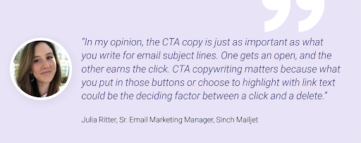
Image Source: Mailjet
Mistake #1 Not Understanding the Purpose Behind Your CTA
Just like your email newsletter, every CTA needs a purpose.
Sure, the general purpose is to steer the recipient where you want them to take action. However, too many marketers only think about this in general terms. They use generic and vague CTA text like “Click Here.” Don’t be that person!
Fix: Make the benefit of clicking your CTA clear.
You can’t go wrong with converting the value proposition in a CTA. Let your CTA explicitly tell subscribers what they will get by clicking and investing their time in your email. For example, swap “Download now” with “Download your free ebook now.”
Think about the following points in order to convey that value in your CTA:
- Know the action you want the subscriber to take.
- Clearly communicate that action.
- Tell the reason they should take that action.
Mistake # 2 Ditching Compelling Language
There is little space to dilly-dally while writing CTAs for an email newsletter design. So, by all means, abstain from using passive and weak language in your CTAs.
A classic example is the vague “learn more.” While “learn more” might seem like a solid CTA, it doesn’t give readers any real motivation to click. There’s no clear benefit or reason for them to take action.
Fix: Use enthusiastic language to elicit a strong response.
An effective CTA needs a compelling language that resonates with subscribers’ pain points, needs, and desires. It should stir them to action.
A CTA like "Get started without the credit card" evokes feelings of ease and trust. By removing the fear of commitment, it makes the next step feel hassle-free.
So, encourage your subscribers to take the next step confidently by using words that tap into their emotions.
Mistake # 3 Making It Hard for Customers to Find Your CTA
Another typical mistake is placing CTAs where recipients can’t find them easily. If recipients struggle to locate your CTA, they're less likely to click. Result? Lower click rates.
Fix: Place the CTA above the fold.
While designing your email newsletter, ensure your CTA is prominently visible in the top half of the email.
The rule of thumb: Keep the CTA above the fold so that subscribers don't have to scroll to find it.
If the hierarchy calls for placing critical information below the fold, above the fold CTAs won’t help. It will go out of sight as users scroll down the email copy. In such a case, place it at the bottom of the email copy so that users can interact with it at the end of the email.
Mistake # 4 Forgetting That Size Does Matter
Another common oversight is designing email CTAs without paying attention to the size of the button. Although it seems minor, the button can make a big difference to the design of the email newsletter.
Too small a CTA button is easily overlooked by readers. And too large buttons can overpower the email copy and disrupt the design. Or even turn off the readers.
Fix: Find the Perfect Balance for Your CTA Button Size
Aim for a size that stands out without breaking the flow of your email newsletter design. But is there a golden ratio?
Well, there aren't any standard size dimensions for CTA buttons, as email marketers adjust the size depending on their goals.
However, some references suggest an average CTA button height of around 47.9 px. Apple recommends a minimum of 44×44 pixels for touch-friendly designs for mobile users.
Another good rule of thumb is to keep the font size at least 16 px for CTA buttons, considering 71. 5% of consumers most often check their emails on a mobile device.
Along with this, provide ample whitespace around CTAs, making them easy to find.
Mistake # 5 Making CTAs Too Long
Lengthy CTAs take too much time to read and can confuse readers. When a CTA is hard to digest, you risk losing your audience's attention. Plus, they might not align with your goal of making CTAs both legible and noticeable.
Fix: A good CTA should be between two to five words.
As per Campaign Monitor and Email On Acid, two to five words are enough to highlight the desired action. Anything longer can look cluttered and confusing.
Mistake # 6 Blending CTAs with the Background
Some designers create CTAs that blend too much with the background. If your CTA does not pop, it is likely to go unnoticed.
Fix: Create contrast with the surrounding content.
Bold and contrasting colors that match the most appropriate colors of the brand color kit are a good place to start. Vibrant colors do a great job of drawing user attention to the CTA.
Muted colors are good for CTAs as long as they contrast with the newsletter's background color, surrounding copy, or visuals.

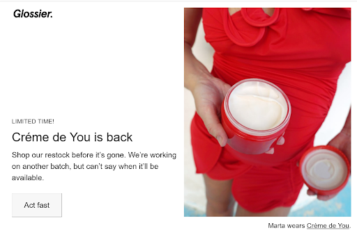
Image Source: Litmus
Mistake # 7 Cramming Too Many CTAs
Do not overload your email newsletter design with too many CTAs. Sure, email CTAs can boost response rates. But overdoing them can undo that progress.
Several CTAs often confuse recipients and dilute the message, making them more likely to leave without taking the desired action.
Fix: Stick to a single email CTA.
It’s best to focus on a single CTA per email and make the next step easier for the readers. In fact, numbers suggest that emails with a single CTA generate 371% more clicks than those with multiple CTAs.
If your email newsletters need multiple CTAs, ensure they don't compete with each other. Highlight the primary CTA with bold colors and larger font while keeping secondary CTAs subtle with smaller text, muted colors, or text links.

Mistake # 8 Not Obsessing About A/B Testing
Don’t think that crafting CTAs for email newsletter design is a set-it-and-forget-it affair. Assuming that CTAs will work well without testing their performance means missed opportunities for conversion. Being one of the top 10 tactics in improving email performance, A/B testing has a lot of value to offer to email marketers.
Fix: A/B test to determine what works best for your audience.
Experiment with CTA design, placement, copy, and timing to specify what performs best for your subscribers. Be sure to test one element at a time to find the exact element that makes the difference.
Wrapping Up
Every call to action in your email newsletter design is an opportunity for conversion. The most common pitfalls listed here can be easily avoided by following the above mentioned steps.
It will help funnel your subscribers down the specific path you want them to take and create a better user experience.
Have you encountered any CTA mistakes that hurt your email performance? Let us know!
Copyright © . All Rights Reserved