7 Web Design Trends That Boost Conversion Rates in 2025
If your website isn’t turning visitors into customers, it’s probably time for a design upgrade. And luckily, web design is getting a serious glow-up. We're talking smarter layouts, bolder visuals, and interactive features that practically beg users to click that “Buy Now” button.
If your site still looks like it’s stuck in 2020, you’re letting profits slip away. But don’t worry.
We’ve rounded up the 7 web design trends that actually drive results in 2025.
#1: AI-Driven Personalization
AI-driven personalization is one of the biggest web design trends for 2025. It’s all about giving visitors a custom experience that feels like the website was made just for them. From tailored product recommendations to personalized content, this trend is helping websites convert visitors into customers faster than ever.
80% of shoppers are even more likely to buy from a brand that offers personalized experiences. When visitors feel seen and understood, they stick around longer and are more likely to make a purchase. This is why big names like Amazon, Netflix, and Spotify have mastered personalization — and it’s paying off.
Here’s how it works.
Martin Seeley, Senior Sleep Expert of Mattress Company, says, “AI tracks what users do on a website — what pages they visit, what products they click, and how long they stay. Then, it adjusts the website in real-time.” For example, if a shopper browses sneakers, the site shows matching socks or workout gear. If a reader clicks on an article about SEO, they’ll likely be shown related content on social media marketing.
This strategy works across industries, not just e-commerce. Service-based websites suggest blog posts, case studies, or services based on user interests. Learning platforms can recommend courses based on what users have previously watched or studied.
Businesses that use personalization see up to 20% more revenue. That’s because personalized experiences feel more relevant, reduce decision fatigue, and make it easier for people to find what they’re looking for. Visitors don’t have to "figure out" the site — it’s already doing the work for them.
“You can use recommendation engines, chatbots, and behavior-based pop-ups to personalize the experience. It could be as simple as showing "Recently Viewed" products, displaying dynamic homepage banners, or sending a reminder email when a customer leaves items in their cart, says Steve Morris, Founder & CEO of NEWMEDIA.COM.
#2: Augmented Reality (AR) Integration
Augmented Reality (AR) lets visitors see products in their own space, try on items virtually, or explore 3D versions of products before buying. This interactive experience increases engagement and drives more conversions.
IKEA, Sephora, and Warby Parker are already using AR to give customers a "try-before-you-buy" experience. And it’s working perfectly.
For example, IKEA's AR tool lets users place virtual furniture in their home to see how it fits.
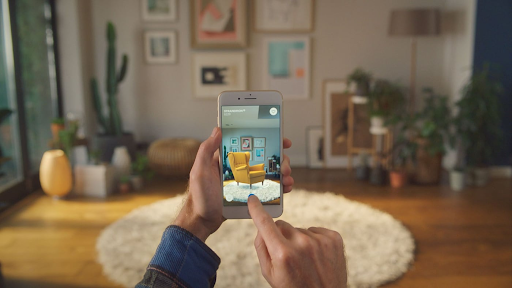
Image Source: IKEA
While Sephora allows customers to "try on" makeup virtually. This builds confidence in buying decisions and reduces product returns.
Plus, real estate sites let buyers tour properties virtually, and educational platforms use AR to create hands-on learning experiences. Even B2B companies are using AR to showcase 3D models of their products, which make it easier for buyers to understand complex items.
Here’s why it matters.
Users are 94% more likely to complete a purchase after interacting with a product through AR. Because seeing a product "live" in your space removes doubt from the buying process. If you can see a chair in your living room or try on a pair of glasses virtually, you're more likely to feel confident about your purchase. This leads to fewer returns, faster decisions, and higher sales.
AR is also more accessible than ever. 8th Wall, ZapWorks, and Sketchfab make it easier for businesses to create 3D product models and interactive experiences without a full development team. This means smaller brands may now compete with bigger players by offering immersive experiences on their websites.
Richard McKay, CEO & Managing Director of Sprung Gym Flooring, says, “In 2025, AR will go from being a "cool feature" to a must-have for brands in fashion, furniture, beauty, real estate, and beyond. Landings that offer AR will stand out, boost conversions, and give visitors a reason to stay longer.”
#3: Advanced Micro-Animations
Advanced micro-animations are one of the most effective web design trends in 2025. These small, simple movements on a website guide users, show actions, and make the whole experience feel smooth and interactive.
Even 94% of users form their first impression of a website based on its design, and micro-animations make a site feel more modern and polished. A simple shake on an error message or a smooth fade-in of content, as you scroll, can make users feel more connected to the experience.
The result?
Visitors stay longer, engage more, and are more likely to convert.
The key to advanced micro-animations is that they’re smart and purposeful. Instead of random effects, they react to what consumers do. Hover over a product image, and it zooms in or reveals more details. Scroll down a page, and key elements slide in to grab your attention. These little movements guide users’ eyes and encourage them to take action — like clicking a button or filling out a form. And it works.
Websites with smooth animations see higher engagement and conversion rates. People are naturally drawn to movement, so a button that changes color or “wiggles” on hover is more likely to get clicked.
The good news is that adding micro-animations is easier. Lottie, GSAP, and CSS animations let designers create smooth effects without heavy coding.
Image Source: Lottie
Whether it’s a playful hover effect on a button or text that slides in as you scroll, these touches make a big difference.
In 2025, landings without micro-animations will feel outdated. People expect modern, interactive experiences. If your site feels flat or "still," visitors leave for something more dynamic. Tim Jones, Founder of Zendash, adds, “With smart, simple animations in the right places — like buttons, forms, and product images — you’ll keep visitors engaged, guide them to key actions, and boost conversions.”
#4: Big Blocks with Vivid Contrast
One of the most eye-catching web design trends for 2025 is the use of big blocks with vivid contrast. This trend focuses on large, bold sections of a webpage filled with bright, contrasting colors.
Here’s how it works.
Instead of cramming a page with too much text or small images, designers use big, colorful sections to show the most important parts of a website.
You’ve probably seen it before — large blocks with a big headline like “50% OFF” in bold letters on a brightly colored background. It’s hard to miss, and that’s the whole point. These sections guide visitors’ eyes and make it easy to spot key info like special offers, new products, or calls to action.
And it drives results. Big blocks take users only 50 milliseconds to decide if they’ll stay on a site, and bold blocks with high-contrast colors instantly catch their attention.
Instead of guessing where to click or what to do next, visitors are naturally drawn to the most important buttons, messages, or products. This makes the landing feel more organized and easier to use.
To make this trend work, color choice is everything. Contrasting colors like black and yellow, white and deep blue, or red and white make each section stand out. Combine that with bold, easy-to-read fonts, and your message becomes impossible to ignore. The goal is to keep things simple and direct, so visitors know where to look and what to do.
Gerald Chan, Founder of CROagency.net, says, “Websites using big blocks with vivid contrast see higher engagement and click-through rates. Because people notice bold design elements more quickly. This trend also works perfectly on mobile devices, where small text and cluttered layouts often fail.” Large, clear sections are easier to tap, read, and follow on smaller screens.
#5: Dark Mode
Dark mode is no longer just a "nice-to-have" — it’s a must-have web design trend for 2025. It’s easy on the eyes, saves battery life on mobile devices, and gives sites a sleek, modern look. But most importantly, clients love it. That’s why major YouTube, Instagram, and Google have all adopted dark mode options.
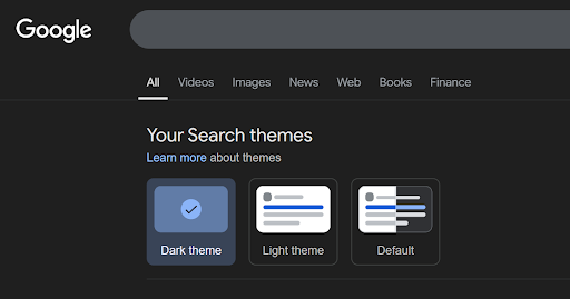
Source: Google
The dark mode is the opposite of the traditional "light mode". That is a color scheme with light text displayed on a dark background, instead of black text on a light background. It reduces the strain on the eye. It is especially important in low-light situations making the text pop.
As statistics show about 82% of people prefer dark mode on their devices. Therefore, with such demand, websites should follow that trend.
Dark mode provides a more comfortable browsing experience, which helps keep users on the site for much longer. For example, when people browse sites at night, a bright white background seems harsh on the eyes. With a calmer color scheme, the visitor is likely to spend much more time on your site, which helps ultimately increase conversions.
Dan Close, Founder and CEO at We Buy Houses in Kentucky, says, “For e-commerce sites, dark mode creates a more "premium" feel, especially for brands selling luxury products. Dark backgrounds with gold, white, or bright-colored text give off a high-end vibe. That’s why so many fashion, tech, and lifestyle brands are adding dark mode options to their websites.”
The good news is that adding dark mode to your site is fairly easy. WordPress and Webflow now offer built-in dark mode toggles so users can switch between light and dark themes. Or, you could provide visitors with a more personalized experience without having to do anything and set your site to automatically match the user’s system preferences.
Per Markus Åkerlund, CEO of MEONUTRITION says, “Websites with dark mode have higher user satisfaction and longer session times, especially among night users. If your site still only offers a bright, white background, it feels outdated to modern visitors. Offering a dark mode option shows that you care about visitor comfort and accessibility. Plus, it makes your site look sleek, modern, and forward-thinking.”
#6: Custom Illustrations
Websites in 2025 are increasingly moving away from stock photos in favor of custom illustrations. After all, unique visuals make landings more appealing and can add personality to any brand. Custom illustrations are designed specifically for a brand to reflect its mission and how it communicates to the user. This sets them apart from stock images that anyone can use.
Custom illustrations help to convey messages and explain complex ideas. Instead of relying on long blocks of text, you can use visuals to get your message across. They may show key information, guide users through the site, and make interaction with the website easier and more enjoyable. This extra creativity will encourage users to stay on the site longer and explore more pages.
The best part?
Custom illustrations are even affordable. Hiring a skilled designer can give you unique visuals that boost your site’s appeal without blowing your budget. With Figma and Canva, even small businesses may add personalized touches to their site.
Adam Fard, Founder & Head of Design at AI UI Generator says, “More brands are expected to jump on this trend in 2025. Because custom illustrations make pages more memorable, modern, and fun to use.”
#7: Interactive 3D Models and Content
In 2025, interactive 3D models are making websites more hands-on. Instead of flat images, users could move, spin, and zoom in on products or objects to see every angle. This makes it easier for people to understand what they’re looking at, and it’s increasing sales, sign-ups, and engagement across all kinds of landings.
Let’s take an example of online shopping. Instead of flipping through product photos, shoppers can spin a sneaker around to check the design from every side.
According to Invespcro, 95% of users say they’re more likely to buy after interacting with a 3D model because they know exactly what they’re getting. It builds trust and reduces the risk of returns.
Also, real estate websites now offer 3D tours, so buyers can walk through homes virtually. Furniture stores let you see how a chair will look in your room. Education sites use 3D models to make learning more visual, showing things like human anatomy or 3D machine parts.
Here’s why it works.
3D models keep people on your website longer. Instead of clicking away, they stick around to explore. More time on-site means more chances they’ll make a purchase, request info, or fill out a form. Plus, 3D content feels modern, fresh, and fun to use.
You can use Sketchfab, Blender, and Spline to create and embed 3D models. Whether it’s a product, a house, or an educational tool, businesses can now add interactive elements without a massive budget.
Final Thoughts
So, we’ve covered 7 key web design trends for 2025. And these are not just design upgrades, they’re must-have to keep visitors engaged and drive more conversions.
Next time, focus on clear visuals, smoother navigation, and a more personalized experience. This way, you can create a website that stands out and keeps people coming back.
Copyright © . All Rights Reserved