6 Easy Ways To Create a User-Centric Website
If there's any one area that web designers fall down on in terms of creating a website it's that they forget about the end user or visitor. This isn't really their fault because everything they've been trained to do, and learned during their career, is about creating sites which are cutting edge, cross-browser compliant and basically feature some of the very latest bells and whistles. The problem remains however that the visitor is being neglected.
So to help you create websites which are not only technically functional but also focus heavily on the UX (user experience), we've put together a guide to help you create sites which not only look great, but are also incredibly easy to use.
Simple Navigation

No matter where are a user arrives on your website they should never be more than three clicks away from being able to access the information they are looking for. This means consistency in your navigation menus, as well as keeping the number of menu items to an absolute minimum. A great navigation system will have no more than 5 elements, for example.
Color Choices

It's hard to believe that some designers still insist on using a dark background with bright text as their primary design palette, but we see examples of this every single day. When you think "design" you should be thinking "accessible" in every sense of the word, and this includes making your site entirely usable for people with visual impairments and/or are using screen-reading software. White space is not a sin when it comes to creating a web template folks.
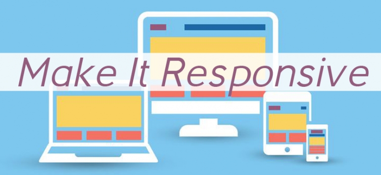
Make It Responsive

If your websites aren't mobile compatible then you're going to find your pool of clients drying up very quickly between now and 2016. The future of web design is creating sites which are fully mobile compatible, so your design protocols should be taking that into account right now. The simple fact is that more and more people are searching for information and shopping online from mobile devices so you need to take this into account.
Visuals Work

Most people go searching for websites based on specific keywords they enter into search engines, so obviously they expect an answer to their question on whatever site they arrive on. While text should be at the core of your website you do also need to have well chosen images to complement the content on your site - images can provide as much context for your message as the rest of the copy on your site.
Allow Feedback

You'd be simply amazed at how many websites you can find where the visitor is given no way to interact with the site/business owners. No email address, no Facebook details. Zero. At best most website designs will include a contact form, but these are hugely impersonal to end users, plus there's the fact that if the form itself is "broken" emails are simply going to go missing. This is the worst possible experience any user can have on your site.
Avoid Cookie-Cutter Design

Designers need to get to know their clients, how they think, what message they want to send to their customers/visitors and then inject that "persona" into how the site is designed. If we can offer no other advice here then it would be this: Don't design the site and then focus on UX elements afterwards. That approach never works, because you're trying to cram user-centered elements into the design as an afterthought. The other outcome here is that because UX wasn't part of the overall design plan, most visitors will find the site difficult to navigate, full of design elements which don't make sense, and they simply leave.
A good designer can create websites which look great and include functional UX elements. A truly great designer can step outside of their own personal needs and desires and create a website that both their client, and their clients' customers, absolutely love.
Which of the above are you?
About the author
Copyright © . All Rights Reserved
