5 Common Web Design Mistakes That Drive Customers Away
A good way to beat your competition is to look at what they're doing wrong and learn from their mistakes. Whether you're looking to start a new business website or improve your existing one with some professional help, here are some classic web design mistakes that you should avoid if you want to increase your conversion rates and earn more loyal customers.
1 - Giving Visitors Too Many Options
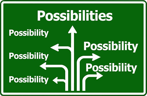
Options are good, right? Giving visitors a spread of options means that everyone can find exactly what they need. Or so the theory goes.
In practice, offering dozens of options all at once is an easy way to overwhelm visitors. It generates unnecessary friction. Sure, everyone can find what they need, but everyone also has to search for what they need. It's also hard to compare options when there are too many of them. You may have heard of analysis paralysis before.
These issues can be avoided with clever design, good menu layouts, well-planned website hierarchy, and more. Even if you ultimately have 20 options of goods or services for customers, if they're split properly, you can make sure each customer only has to choose between 2 or 3 options at any step on their journey.
Or you can do what Apple did in 1997 and streamline your product line. Fewer options mean a more straightforward customer journey.
2 - Making Menus Hard to Find
Innovation comes at a risk, especially when it comes to modern web design. We're far enough into the digital age that most web users know where they should check when they want to find menus for a website: the navbar at the top of the page.
They know that because this placement is industry-standard. However, because it is standard, it is also boring, leading many to seek to stand out by innovating in that department.
That is fine, as long as the innovation does not make the menus harder to find. Hard-to-find menus generate friction, which leads to frustrated visitors, and ultimately a lower conversion rate. There's no getting around that.
It is also smart to use clear and concise labels for menu items. Visitors should not find themselves having to try out several options to see which button takes them to where they need to be.
3 - Poor Use of Color and Contrast
There are different ways poor use of color can hurt the user experience on your site. Issues here can range from simple things like a lack of contrast making text hard to read to more advanced blunders, such as using colors that conflict with your branding and message.
If you're new to color theory, this infographic made by Digital Synopsis covers some useful basics. However, if you don't want to go as far as choosing the right colors to elicit desired emotional responses, you can still get a lot of mileage out of using color and contrast to make your CTAs easier to find and your website easier to skim.
4 - Hard to Read Text
Most people don't design their websites to be hard to read. Readability issues are often caused by accidents. It's easy to add or change elements that affect readability as you build your website without realizing it, especially if the problem you caused only affects readability on certain devices.
That's why it's important to regularly review your website with a critical eye looking for potential readability issues. Here are some elements you should watch closely during these reviews:
- Font Choice: Select clean, legible fonts and avoid overly decorative styles that can be difficult to read, especially on smaller screens. They may not be exciting, but sans-serif fonts like Arial or Helvetica are generally easier to read online.
- Color and Contrast: Text should be easily distinguishable. Avoid color combinations that are too similar, such as light gray text on a white background or dark blue on black. If you're not sure if you have enough contrast, try using this WebAIM contrast checker tool.
- Moving Elements: Text that moves around too quickly — as part of a video, carousel, or slideshow — is hard to read. For reference, the average adult can read 238 words per minute or about 4 words per second.
- Page Resizing: Test your website across devices and screen sizes to make sure all the elements stay readable and reasonably sized.
5 - Muddy Value Proposition
Here's a thought experiment. If a random person were to open your website right now, how long would it take them to figure out what your business does and how you're different from the competition?
Many websites take far too long to get to the point. Or they skip introductions entirely, getting straight into the nitty gritty of their products and services. That's fine if you sell something simple like clothes or food, but for complex goods and services? That can be a problem.
Your website should start with a firm and clear introduction. This is who we are, this is what we can do for you, and if you're looking for X, you're at the right place.
People spend money to solve problems, and you only have 15 seconds to assure a visitor that yes, you can solve their problem.
When visitors need to scroll down and scan the site — or worse yet, go past the homepage — to even figure out what your company does and if they're at the right place, they're much more likely to just leave. And take their business to a company that is more beginner-friendly.
Think of your value proposition as the elevator pitch for your company. It should be conveyed as quickly and as clearly as possible, with the least amount of jargon necessary. Preferably while making use of visual elements and other aids.
The exception to this is, of course, companies that offer goods and services to industry experts. In those cases, jargon is less of a barrier for entry, and more of a handshake that says: "Yes, we know this industry, our team is full of experts like you".
Copyright © . All Rights Reserved


