4 Design Tips for Your Locations Page
An ideal Locations page is both functional for the user and well-optimized for search engines. It’s especially important for businesses with multiple locations and is essential for getting the most out of your website's content and search engine leads.
Very large businesses with thousands of locations, such as Target or Walmart, often have a "locator" feature where visitors can insert their ZIP code and find the closest location. For many businesses, though, it makes more sense to list all the locations manually, both for user experience and for SEO purposes.
For businesses with multiple locations, here are four design tips to maximize the effectiveness of your Locations page.
Make the Locations Page Clear and Present
If your Locations page is tucked away somewhere, as opposed to being prominently linked to from the home page and every internal page, search engines and visitors alike will struggle to find it. Your company’s foot traffic and number of leads will likely suffer as a result.
In written content on your business’ website, link every so often to the Locations page, mentioning something along the lines of, “Be sure to check out our various locations here!” at the end of a blog post or a page with general information.

A nice example of prominent Locations placement is on The Melting Pot’s homepage, where “Locations” features prominently in the navigation. This makes the page impossible to miss, and users who click on "Locations" will find themselves on a page with links to unique landing page content for each location as well as a map for users who prefer to browse that way.
Create a Unique Landing Page for Each Location
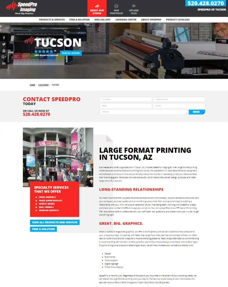
Ideally, the various locations will include a link to that location’s own landing page. SpeedPro Imaging does this perfectly on their Locations page, with each location featuring a link that brings visitors to additional information.

For example, clicking on "Tucson" will bring you to a page that features the location's specialty services — decals, event tents, table toppers, trade show displays and more — in addition to information about the team in Tucson.
A big no-no for multiple landing pages is repeated content. In addition to search engines looking negatively upon duplicate content, the lack of information for each location will result in a lack of clarity, forcing potential leads to call the location up or assume it’s too much of a hassle. Let each location's landing page provide details on the location itself, such as the team’s background, site accomplishments and region-specific services.
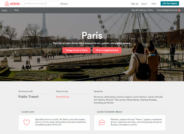
Airbnb’s Locations page is another excellent example of content variety, since each page features unique photography and original copy representing their respective cities. Easy-to-digest sections like “Locals love” and “Locals complain about” add to the appeal.

Ensure Mobile Compatibility
Since 89% of people in the United States 18 and older own a smartphone, ensuring mobile compatibility for your Locations page and any landing pages it points to is extremely important.
Warby Parker knows that their customers might want to try on their glasses in person, so they made sure to optimize their locations page to mobile devices. Clicking through to the specific location’s landing page reveals their contact info, an interactive map, photos, and a description of their location.

A large number of customers could be searching for your location while on the road, with limited internet connectivity and time. Making mobile-friendly design a priority is vital as a result, with the modification often requiring just a simple WordPress plugin.
Ensure All Desired Information Is Listed
An ideal Locations page answers any questions a visitor may have about the location. This includes:
- Opening and closing hours for each day of the week
- Specific information regarding the location's services
- General directions from nearby landmarks or highways
- A prominent phone and (if needed) fax number, plus an email address if necessary
Ensuring that you provide ample information, while keeping the page visible and filled with original content, can go a very long way in converting casual website visitors into meaningful leads. If you follow these four simple web design tips, your Locations page is sure to prove useful.
About the author
Copyright © . All Rights Reserved
