
555 Design
As the site's creator aptly puts it, 555 is a graphic journey through a grungy filter. Stop by and you'll find loads of excellent grunge art, photography, wallpapers and the like.
Loading...

As the site's creator aptly puts it, 555 is a graphic journey through a grungy filter. Stop by and you'll find loads of excellent grunge art, photography, wallpapers and the like.

Russian designer Smitana specializes in Flash and graphics, and her Flash animated Web site is naught but a gallery chock full of examples of her work. This is truly a high quality portfolio.

Tokyo Plastic is an amazing, just-for-fun Flash site with assorted high-tech antics and its fair share of Japanese dolls.

Featuring a gallery of album covers, a juke box jumping with electro-rock, and unusual graphics – this Grunge Style Web site appeals directly to its audience: the heedless and questioning.

The core idea behind this website is simple: we know how to create and manage spaces. Using black and white, subtle Flash effects, the architectural and interior design group at www.horsnormes.be presents a multitude of ways to customize your environment.

Any rule can be broken in a talented way. Forget all the usability principles and web design rules and simply admire this unique Web masterpiece.

This website is the Digital Portfolio for Phillip Pastore. The website contains video and web portfolios. Structured, with two overlapping grids, one for imagery and one for typography, the website conveys a strong sense of motion with simple navigation.
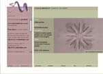
Toa Electronics, British Airways and British Rail are but of a few of the clients with whom Sarah Medway has shared her considerable web design skills. Her Clean Style website emphasizes her preference for clarity of content.
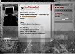
You'll find exceptional integration and flow on this Belgian web design site. Note the dramatic and effective use of Flash.

Roberta Benedetti has got legs, and she knows how to use them. This is a simple Flash driven site, both easy and attractive, with lots of legs. Site content is eye popping. Integration and flow are good.

This Clean Style Flash site has an unusual navigation menu, which is not fully optimized. However, it boasts good integration and flow, and includes a crisp profile image of its creator. Check out the use of Flash here.
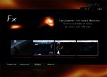
A Flash based website, Balthasar.com proves usability experts wrong. Here the user interface is as simple as the design is complex. Integration and flow are outstanding!

Making sense of chaos, photographer Kurt Ross presents nature in all her transcendent beauty. He saunters leaf by leaf through forests, taking time to show the details on this Clean Style website.
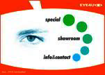
Groovy! Here psychedelic colors, whirling daisies and flying geometric shapes combine to assault the senses. This German active media and web design firm deserves kudos for its truly vibrant Flash work and impressive demos.

Providing insights to enhance competitive advantage in the marketplace, this website will appeal to businessmen. Here you’ll find tempting excerpts of business related books in PDF format.

3D Reality.Net, a leading marketing and Internet solutions provider, stamps every pixel of every project with its enthusiasm for diversity and innovation. Here you’ll find aggressive yet subtle Flash effects.

This complex Clean Style website from Hillier Architecture embodies all that the firm stands for. It is both refined and detailed. After all, design is, according to Hillier, drawn from a combination of very simple, form giving conditions.

Multimedia Developers, gather round! This high quality Flash based website has one or two wise words to say. Short on words and long on information, the site is effective, dynamic, well integrated and hard-hitting.

Shop Solutions. Store Architecture. Only seconds into the intro, Planunsburg Moysig reveals all with four words. Check it out. This designer has written an effective Flash-based thesis for his webpage.
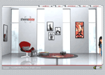
Hooked on photography? You’re in luck. This Flash based website is wall to wall photographs. We suggest you check out 'In Black and White', the photographic exhibition on women in India.
Copyright © . All Rights Reserved