
Mimi
Robert Frost once wrote about an old dog who barked backward without getting up... I think we know what he was barking about… Check out the antics of this Paper Made style pup!
Loading...

Robert Frost once wrote about an old dog who barked backward without getting up... I think we know what he was barking about… Check out the antics of this Paper Made style pup!

Navigation is a breeze on this website executed in Paper Made style with Flash effects. Be sure to check out all the links, to fully enjoy the portfolios available here.

This way cool 3D Style website is just bursting with self-respect and enthusiasm. Yes, we say give the man a cheer. His father made the right decision when he sent him to art school in America.
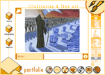
Personal portfolio website for artist and designer Neal Jenks includes work in web design, 3D modeling and animation, Flash animation, illustration, and more.
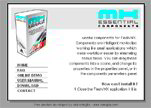
Paranoia’s lab sketchbook – Kaliromiglia - is a humorous imitation of a Flash work in process. When you enter the site, you cannot understand where you are – either in a Flash tutorial or on a real website – and the feeling that you are missing the point never dissipates.

This is an outstanding site for those who are thinking about self-immolation. Here you’ll find a wide selection of matches, torches and even an example of a burning wooden man.

Check out the FX lab on Advertising Visual’s website. You’ll find a really cool ring made using 3d modeling with Maya post production-lighting motion graphics. By the way, this design firm works for clients like America Online, Dreamworks, and Bank of America.
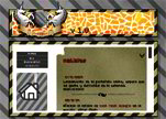
Although this is a tiny site with very minute font sizes and miniscule pages, it manages to create a big impression. For a usability nightmare, click here.

Who said that three things cannot be long hidden: the sun, the moon, and the truth? Seems he would have added a fourth thing if he had seen this Paper Made website.
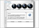
Here we have a stylish blue and grey composition with simple understated Flash effects. Easy to use, pleasant to look at, this website gets top marks.
Look to Ichor Digital for stunning multimedia experiences that stimulate the senses and touch the emotions. There’s nothing extra here on this Vector, Dark Style website. Kudos to James Mason.

Mosaic Mania. This rather wide portfolio belonging to young web designer Ben Barry is impressive. Apparently, he simply could not choose only ten of his best works to place on the main page.

If you’re contemplating suicide, then come to this Paper Made website for a good cry. Illustrator and poster artist Justin Kamerer stamps despair and countercultural angst onto everything he produces.

Awesome portfolio! Photographer Mitya Kouchelevitch uses the post-holocaust world as the necessary location to contest ideology. Like many other artists, she addresses life’s transience, how it is liquid and moving and how we are but molecules within it. Solid Flash enhanced Clean Style website.

Sometimes less really can be more. Not a usability nightmare, this simple Clean Style website moves like rain over banana leaves. We’re talking slick. But the navigation menu really is lacking something…
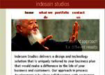
Webdesigner Dirk Hesse is talking CSS, and we're listening. Wow. His website has no Flash effects. Pay attention: this is what happens when usability is addressed by the right people.

This extraordinary site features a some great images taken by a very influencial photographer, Charles Miller.

What do you get when you take a nice layout integrated with flash, add some funky noises, and a great DJ? Christoper Lawrence's website. Check it out.

A clean layout for a great team of interior designers. Windsor Hills Resort Interior Design is a wonderfully put together flash website.
When your the creator of the M&M commercials, MAD TV intro, Giecko animations, and so much more. You can't help but be excellent. Check this site out today!
Copyright © . All Rights Reserved