
I Digital Emotion
Picasso once said that art washes away from the soul the dust of every day life. If it’s true, you can experience raptures of catharsis through this Futurist Style site.
Loading...

Picasso once said that art washes away from the soul the dust of every day life. If it’s true, you can experience raptures of catharsis through this Futurist Style site.

This website has excellent Flash effects, impressive design, clever animation and a high level of usability.

This first-class Flash site embodies the best of both Flash animation and clean HTML code. What a rather rare yet laudable move for the creator of Flash sites.

Original flash papermade style site. All content is placed on incline. The site is made in old american comics style. So, here goes the Q: who's gonna make it - Los Angeles or New York? :)

A Russian site of high quality, this is an exceptional example of Clean Style with 3D elements. Very skillful use of empty space – the site is optimized for 800x600 and higher resolutions.

Featured in international publications like Vogue and Harper’s Bazaar among others, photographer Mateo Garcia’s talent has found a new home on this simple, stylish Flash site.

Here you will find scribbles and giggles and deadly serious freedom of expression born in the copyright era. Visit this Flash enhanced website and contribute your own projects and ideas.

Giving the customer exactly what he wants seems to be what drives the owner of this Flash enhanced website. Here you'll find navigation tools that would frighten any submarine captain!

Downtown is where we all want to live. Starck has scattered the world with architectural tours de force and now he has made a triumphant display of his work on his Flash enhanced website.

Calling all animators! Check out Portland Studios *Illustrations ‘R’ Us* website, which was executed, some might say - appropriately enough, in Paper Made Style.
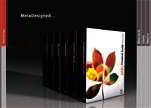
MetaDesign creates entities, interfaces, and environmental graphics with deep thinking and broad impact, but not with a lot of panache. Here all sword flourishes are kept to a minimum. Clean site. Well-designed.

W3C CSS validated, 2 Monks and a Moose have what it takes to make a clean, well-coded website. Check out the sharp photos and motion clips in this portfolio.
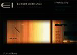
A classical Dark Style site developed in pure HTML without any animation effects but it still looks great. Elementinsites.com serves a living example of an impressive and stylish site developed with HTML only.
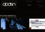
This site represents the perfect combination of Dark and Nature Styles which was considered to be unaccomplished in Web Design before. This masterpiece was developed using CSS technology without any Flash animation - not a simple task. Our hats off to the QuoobDesign team.

Artist, designer and media editor Mark Wisnioski presents his web design portfolio in Futurist Style, which is marked by elements of possible discovery, darkness and mystery, and inexplicable hope. Great navigation.
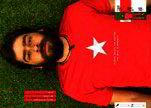
Welcome to the world as seen through graphics designer and photographer Emilian Rodriguez's eyes. Everything is clear on this Neutral Style website. Great portfolio!

Some people are entire like oysters with so many pearls inside them. And some websites are likewise closed and self-sufficient mysteries, with navigation tools whose purpose is not to reveal, but to widen and deepen the intrigue.

There is little doubt that this URL will be for devotees of Retro Style. On the downside, the unique navigation menu at this website can be rather confusing.

Jacob Nielsen would have a fit if he saw this site. Nothing is clear. What should you press? All the same, this Retro Style site is original and stylish. Enjoy it. Good photos, good music, good feelings.

Grunge – once purely a working-class fashion for people who were either shabby or dirty in character or condition – has been redefined by 504Destruct.com.
Copyright © . All Rights Reserved