How to Write Stellar Copy for Your Web-Design Portfolio Website
Being a web designer is about so much more than just being a very skilled designer who stays on top of the latest coding and technical details. Since being a web designer means, for the most part, a whole lot of freelance work, you have to essentially be a good businessman or woman to succeed. If you can't do something as basic as writing gripping and persuasive copy on your web-design portfolio, then you will not have much success at snagging clients.
The fact of the matter is that writing stellar copy means you can transform your little, old portfolio into a mighty lead-generation machine that brings clients right to your doorstep! That's a position of pure power that every designer should want to find himself in. Your potential clients will be going through your online portfolio, making assumptions about the kind of designer you are without any other additional details.
While it sure can be difficult to write stellar copy for your portfolio, it helps to understand who your target market is. Once you know this, then you'll have fewer problems getting clients you want to get in touch with you to hire you!
Look at It From the Viewpoint of the Client
It's always a great starting-out point if you try to see things from the viewpoint of your prospective clients. This way, you are likelier to tune into just what they are looking for from a designer. Since clients searching for designers are probably going to look at many portfolios before they make their choice, it is all the more important to really work on writing stellar copy to promote your design services.
One thing that is a proven winner is to promote yourself as a designer who not only has rabid passion for what he does, but can also provide a multitude of benefits to clients. In business, clients really only care what you are able to do for them and not much else. Your portfolio copy should mention how you eat, sleep and breathe design, as well as how you're able to increase a client's conversions on their site.
Check out web designer Lizzie Seymour's portfolio website. On her homepage, she stresses that she's in love with design. You can't get to the point quicker than that!

Write a Super-catchy Headline
A lot of reading on the Internet revolves around headlines and, specifically, how they succeed at captivating and drawing the eye of the reader. That's why having a super-catchy headline on your portfolio website will work wonders at producing increased conversions from clients looking to get in touch with you.
Let's look at web designer Kendra Schaefer's portfolio website. Her homepage confronts you with the huge-font headline that reads "This is how I feel when I'm not making the Internet." The absolute effectiveness of an approach like this - besides being highly unique - is that it instantly captures the site visitor's attention. You want to know what she means by her implication, and you'll therefore continue exploring her site. It's highly effective stuff!

Keep Things Minimalist
Minimalism has been a trend in web design for a while, so it's no surprise that web designers are adopting this look on their own portfolio websites. Minimalism makes sure that one's web design is clean and easy to absorb, thereby making the user experience all the better. And, of course, the longer potential clients stay on your website, the likelier they will become conversions.
On web designer Bjorn Meier's portfolio website, it's clear that he has embraced a neat and simple design that works exceptionally well. His homepage copy is just the name of his own studio in front of a nice shot of very basic furniture that looks like it could've been bought from Ikea. At any rate, such a presentation tells prospective clients that Bjorn's design style is well-organized and free of clutter.

Use Casual Language in Introductions
These days, people are into casual forms of communication more than anything else. Keeping things formal is soooo 1890s, and it has no place in the 21st century, to say the least. Keeping things formal just sets up unnecessary barriers between you and your all-important clients, so drop the formalities when you write portfolio copy.
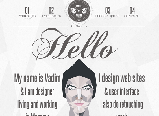
Russian web designer Vadim's homepage copy is the epitome of keeping things casual, which no doubt has helped him to snag many a client. Not only does he greet site visitors with a huge, can't-miss "Hello," but he also introduces himself, provides a bit of information on what he does and even shares where he lives. This is highly efficient copy as, in just a few words, Vadim has casually provided details that make prospective clients feel at ease with him.

Writing Good Portfolio Copy Is Harder Than You Think
You can't just write anything on your portfolio website because the goal is to turn your website into a lead-generation machine that will produce a high rate of conversions from your site visitors. As such, it's not acceptable to merely wing it and write the first things that come to mind. Doing that will certainly cause an unimpressive rate of conversions.
The job of your portfolio copy is to persuade prospective clients to at least contact you about your services. It can only do this if it's written with purpose in mind. It has to relate to your clients' needs, catch their attention and not let it go anytime soon, be super-simple and be casual. Copy that satisfies all of these points will boost your success with prospective clients - guaranteed.
What does your portfolio website look like? Have you invested a lot of thought in the copy that you've written there? If so, have you seen any good results? If notâ?¦why not? Be sure to tell us all about it in the comments section below.
About the author
Copyright © . All Rights Reserved
