How to Create a Clean Website Layout in Photoshop
Hi Guys!
We're a huge web design resource and actually we were freaking boring till some day. But that's something we're already working on. And rest assured that today's tutorial will bring you some useful web design skills.
This is an intermediate level tutorial that uses such a great learning resource as free website templates, and some things here may seem to be tricky, but why not have a try? Let's get the ball rolling :)
But before we start check this useful resources that will help you to create stunning web design layout:
- Web Design All-in-One For Dummies
- HTML and CSS: Design and Build Websites
- Learning Web Desig
- Web Layout Tutorial Category
- How to Create Financial Website Layout
- How to Create a Clean Portfolio Layout in Photoshop
First of all,look at the final result of our tutorial. Today we're going to create this lovely website layout:

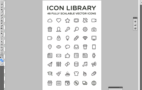
To design a web layout like this,you should download the "Linecons Free - Vector Icons Pack"
By the way, you can download a free template based on this design: Free Business Template.
Subscribe to our newsletter and get a huge bundle with design freebies and useful tutorials once in two weeks:
Step 1
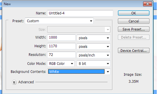
Let's start at the beginning. Just fire up your Photoshop and create a new document (CTRL+N). See the parameters below.
Step 2
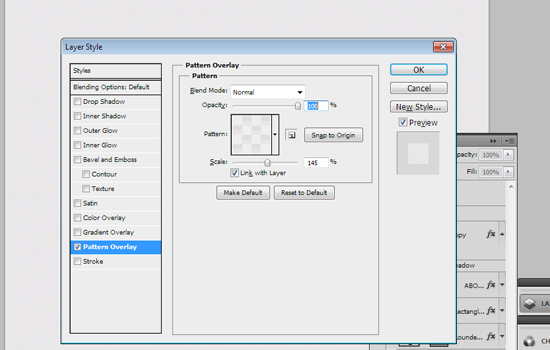
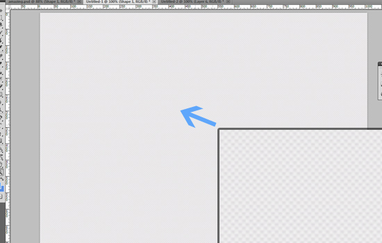
Now you should add some pattern to your background.
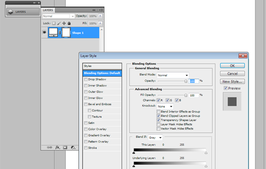
Layer Style -> Blending options-> Pattern Overlay. Look at the screenshots below:
Step 3
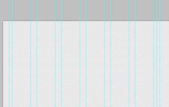
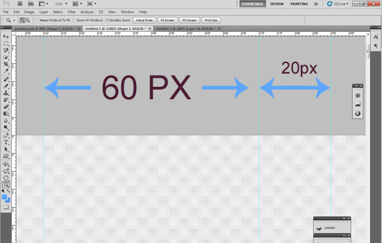
We want to create an awesome design, yeah? That's why we should use a grid system for designing. You can easily create a solid visual and structural balance of websites with grid-based designs.
Put some grids to your design with intervals of 60px and 20px.
Step 4
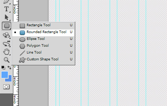
So... now it is time to design the menu of your future website. Use the Rounded Rectangle tool to create it (radius - 3px). The width of your menu is 940px, the height is 34px.
I think that it is an easy task to create a website's menu. To be sure, look at the images below:
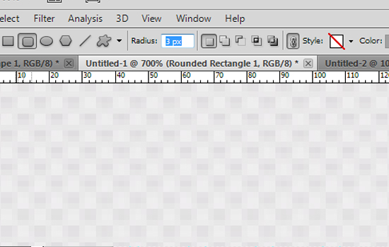
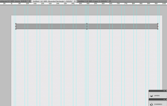
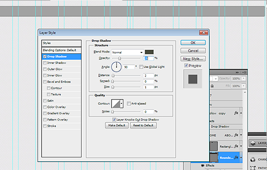
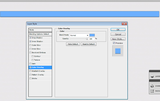
To make this menu more eye-candy, go to the Blending Options -> Drop Shadow. Use the settings that you can see on the screenshots:
Blending options-> Inner Shadow
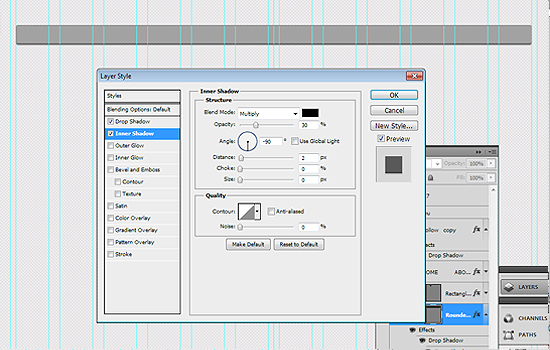
I chose the #6bafff color for this menu bar.
Step 5
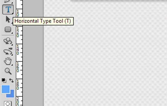
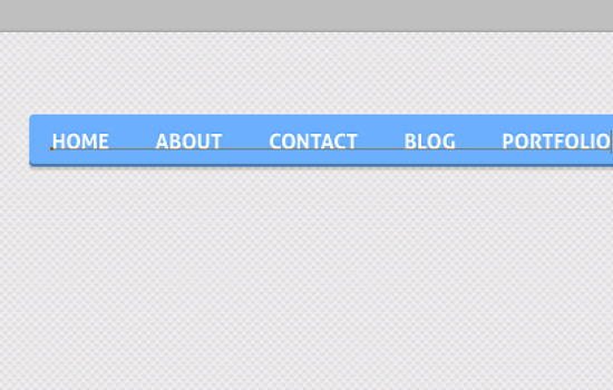
Let's add some text to our menu. Use the Horizontal Type Tool for it.
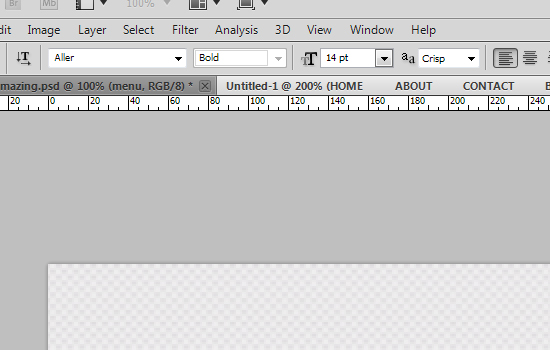
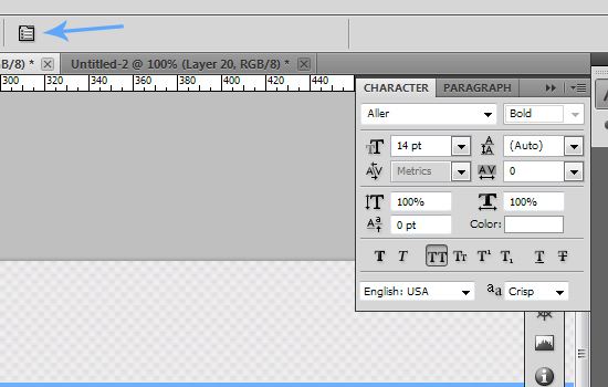
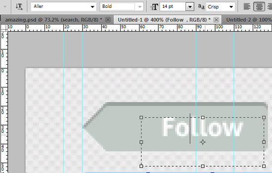
You can create your design with any font you like. I used the Aller [bold] font. The size is 14px.
Step 6
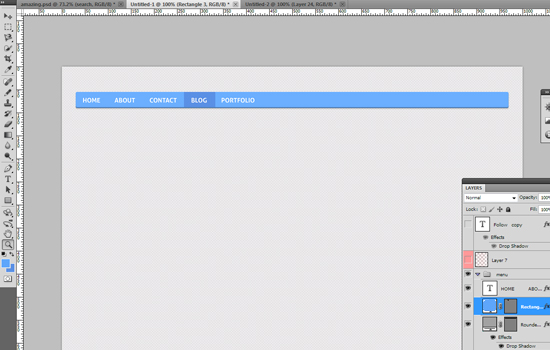
All the menu buttons are links and the designer should show how their hover state looks like. So, create are rectangle (the color that I've used for it is #5a90e5).
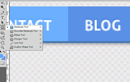
Our result:
Step 7
Every decent website has a search form. Let's create it too :)
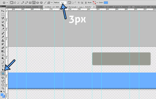
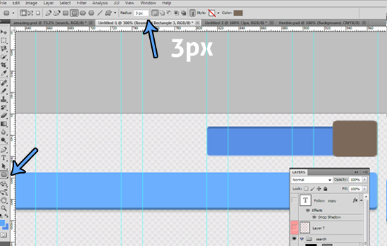
Use the Rounded Rectangle tool (radius - 3px) to create a search form with the following dimensions: 124px and 26px
Add some inner shadow: Blending Options-> Inner Shadow
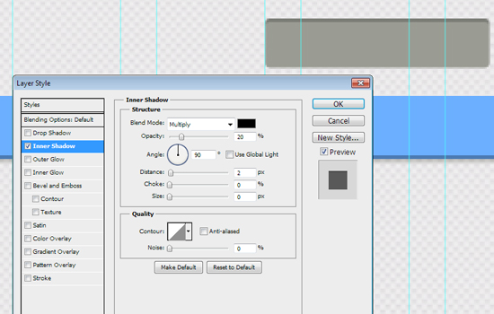
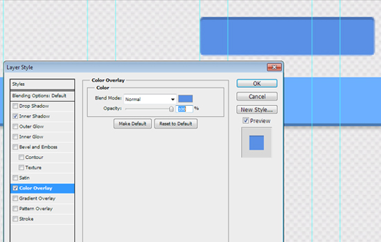
Blending Options-> Color Overlay, color- #5a90e5
Use our favorite Photoshop tool one more time :) Create one rectangle with dimensions 41px and 32px
Blending Options -> Drop Shadow
Blending Options -> Inner Shadow
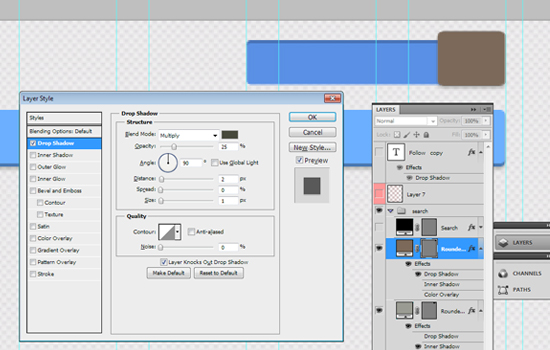
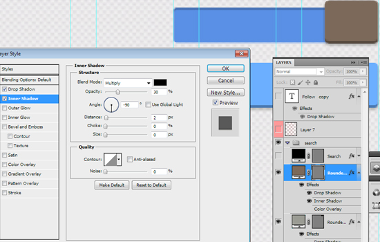
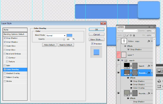
Blending Options -> Color Overlay (color - #6bafff)
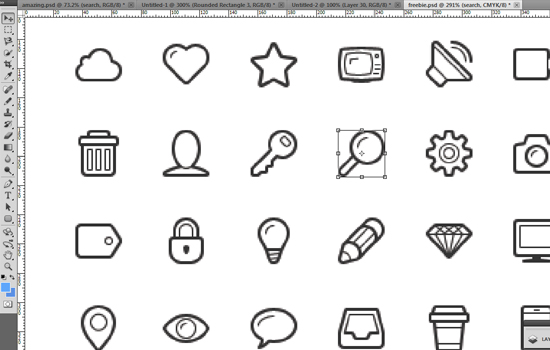
Now it is time to use icons that we've downloaded at the beginning of this tutorial. Open the "Linecons Free - Vector Icons Pack and find the search icon there. Just apply some bells and whistles to it.
Here is our final result for the search form:

Step 8
Social media connections are very useful and important for every website. That's why today we'll also learn how to create a simple Facebook button. Again with the help of the Rounded Rectangle tool (radius - 3px), we'll create a button
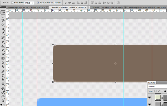
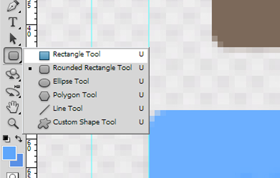
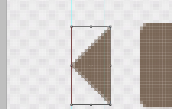
Then use the Rectangle tool (rounded) to create a square (holding the Shift button) with the following size - 16px
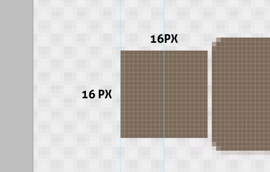
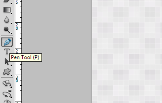
Choose the Pen Tool and cut off half of this square.
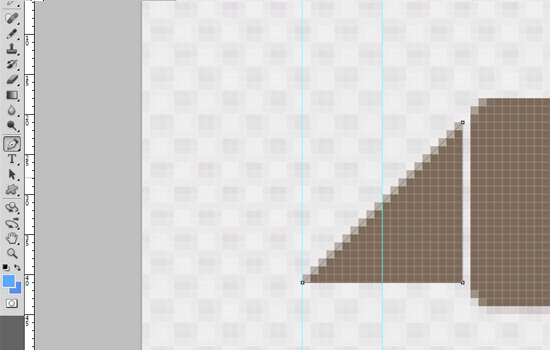
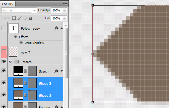
Edit-> Transform->Rotate to move this triangle and place it on the left side of the rectangle
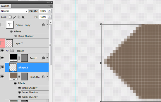
Select all your "Facebook" layers and merge them (Ctrl+E).
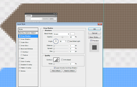
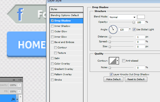
Blending Options-> Inner Shadow:
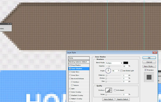
Blending Options-> Color Overlay (#c1cac5 )
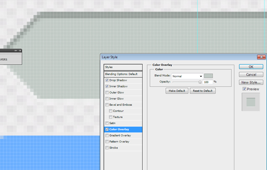
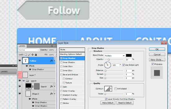
Now add the "follow" text to our Facebook button and play with its blending options.
Try to create your Facebook logo for this button. For example, you can create the "F" letter, decorate it with a blue color (#5a90e5).
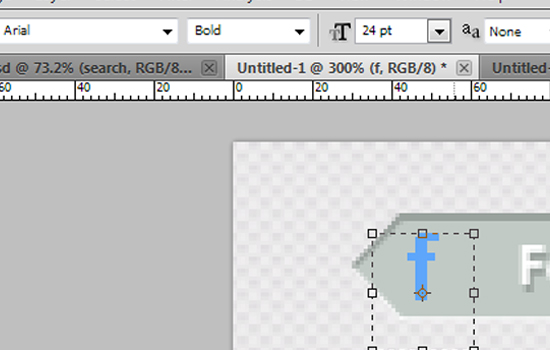
Play with Blending options (add a white shadow)
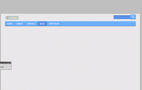
WOW! We did it :) Look at the final result of our menu bar:
Step 9
Create a new shape: width 940px, height 372px
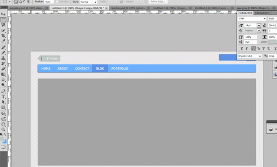
As always, add some shadow:
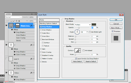
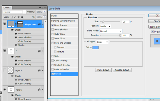
And a border: Blending Options-> Stroke (20px, color- #6bafff)
Step 10
To create nice slider, we should add some images to it. With the help of the Ctrl+Alt+G shortcut,create a clipping mask.


Step 11
Use a bunch of free icons again. I've selected the following icons: "settings","bubble", "photo","world"
Add them to our design (don't forget to use the grid), distance - 180px

Step 12
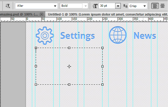
Add some text. You should use the same font that you used for your menu bar. Set the font size to 30px.
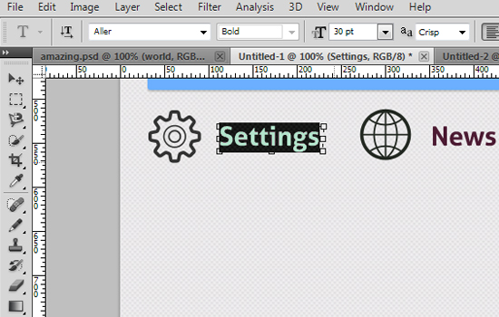
Play with Blending Options: add a white shadow, color overlay ( #6aaefd) and an inner shadow.
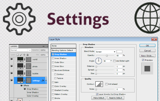
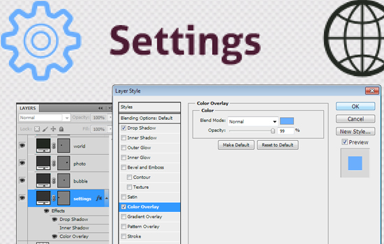
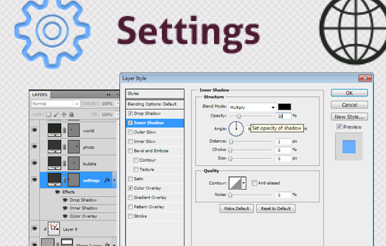
Copy the styles of this layer and add it to all your icons:
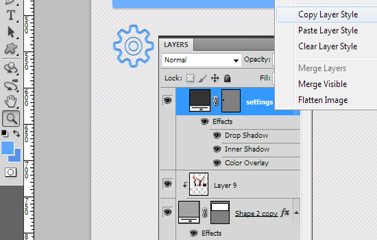
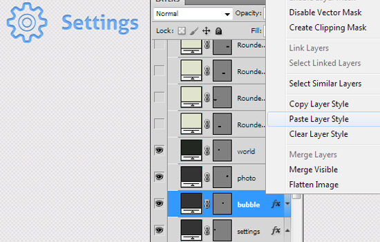
WOW! Look at this amazing result!

Step 13
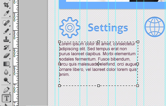
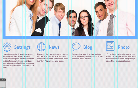
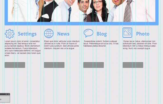
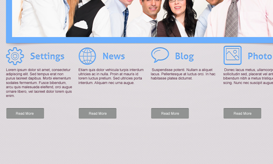
Fill these four columns (width of each - 240px) with some "loremipsum" text. It is better to add a different text to every column.
Step 14
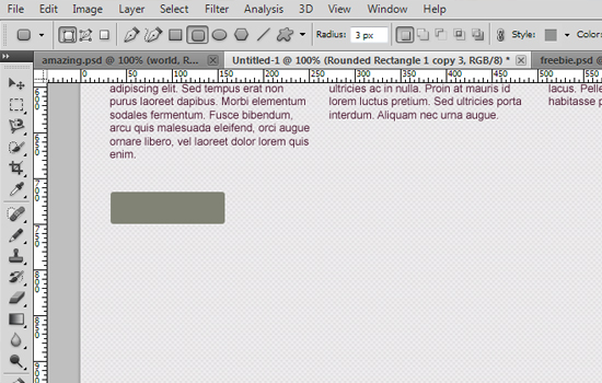
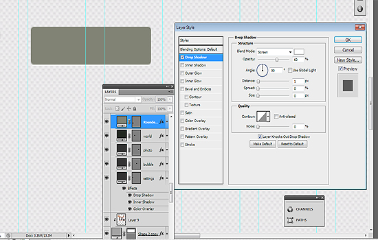
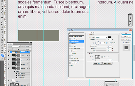
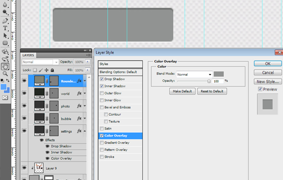
Create a Read More button with the help of the tools that we've used before.
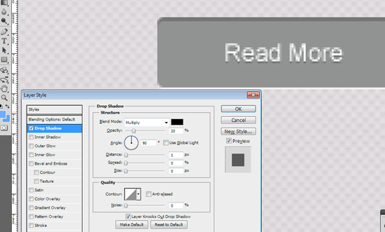
Blending options-> Inner Shadow, Drop Shadow, Color Overlay (#919392).
Step 15
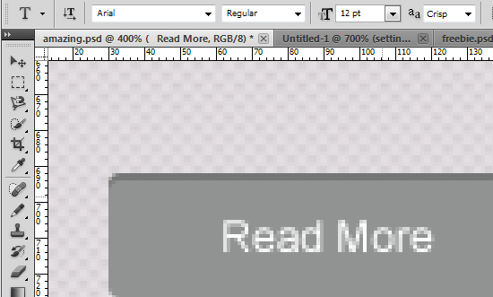
Add the "Read more" text to our button.
Step 16
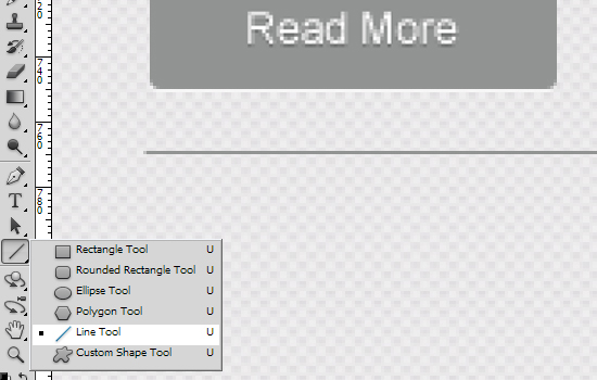
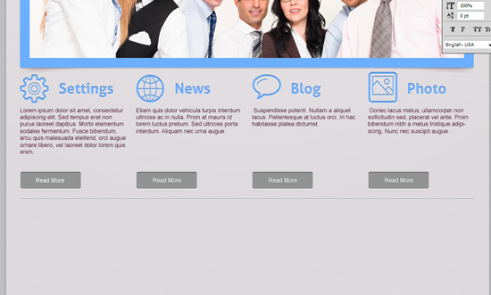
Now we should separate the main content of our future website. Create a 1px line and add styles of your "read more" layout to it.
Step 17
Your next block can be a section entitled "Partners" or you may want to showcase your latest blog posts.
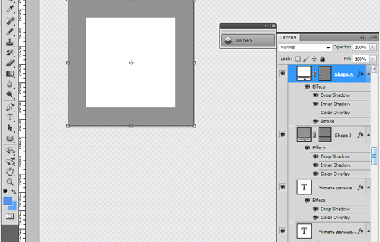
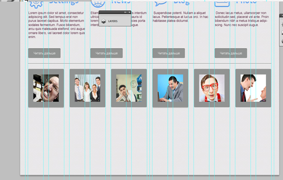
Use the Rounded Rectangle tool to create a square (hold down the Shift button).
Radius - 3px, width and height - 138px.
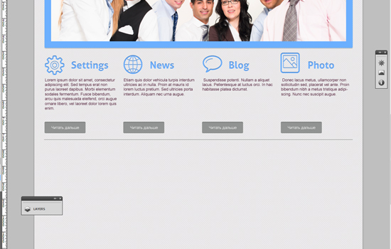
Go to Blending options -> Stroke to create a border with the settings below:
Size- 20px, color #919392
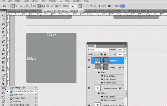
Copy and paste this element 5 times :) Place these squares with the interval of 20px.
Step 18
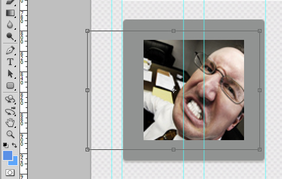
With the help of a clipping mask, insert the image into the square.
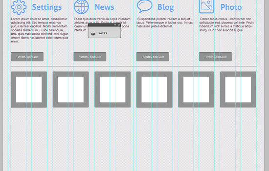
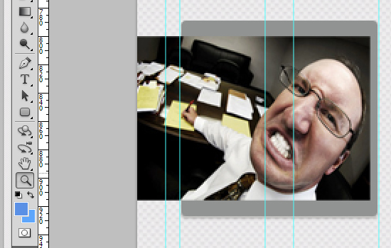
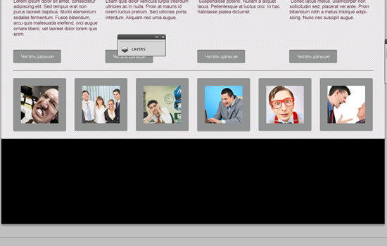
As you can see, you really can use this block for all sorts of purposes. Result:
Step 19
The footer of the website is as important as the header, if not more so. Ask yourself, "What do you want your visitors to do when they reach the bottom of the page?" The answer you come up with will be a great starting point for designing your website footer.
Now it is time to design a cool footer for our cute website layout. Let's make it bright :)
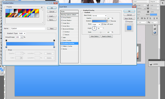
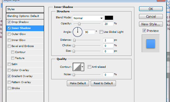
Add some gradient, for example #3a8df1 - #6bafff, and inner shadow
Step 20
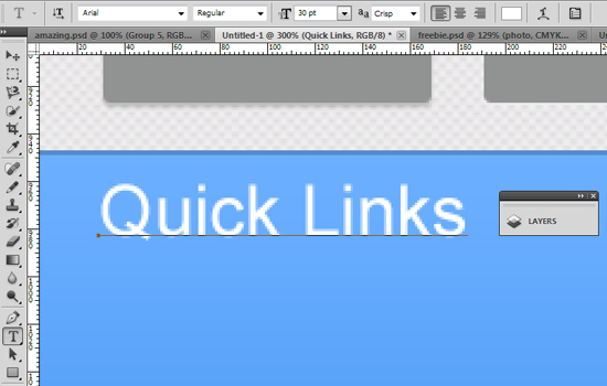
We'll add three blocks into our footer: Quick links, About Us and Follow Us
Use the Arial Regular font for titles (30px) and add styles as on the screenshots below:
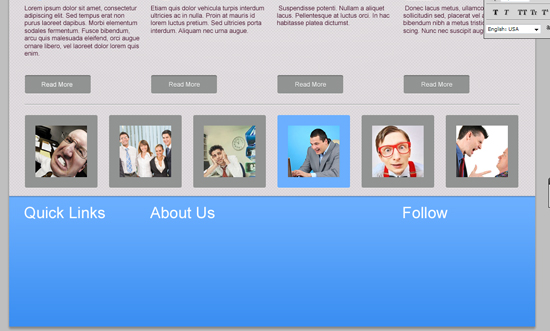
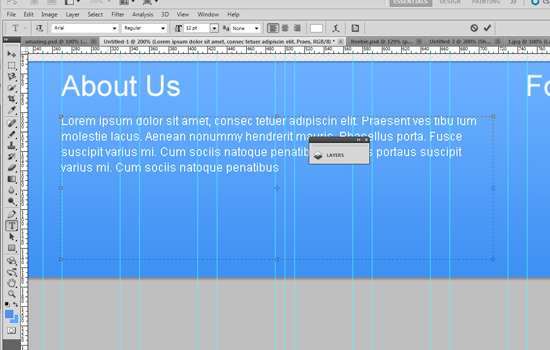
Use the Arial Regular font for the text in the About Us section (12px).
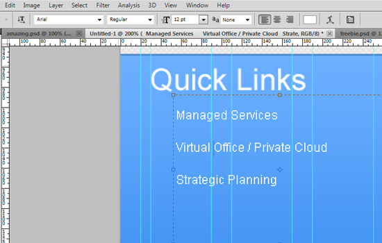
The text for the Quick Links section - 22px.
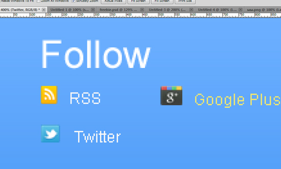
Put some standard icons into the Follow section - RSS, Google Plus+ and Twitter
Woohoo! We did it! The final result of our tutorial:

How To Make a Simple Web Design Layout using Photoshop
Freebies: Free HTML Template
Download this free business HTML template here. And here you'll find a plethora of awesome free web templates. Don't forget to push share buttons, because sharing is sexy ;)
About the author
Copyright © . All Rights Reserved
